Hunted
Hunted is a project my coworker and I took on. We collaborated on the Discover and Define steps and took our own routes during Design and Deliver.
What is this? I have always been passionate about the future of cities and I value when places I care for are close, such as friends' houses, religious houses, and work. I struggled during my apartment hunts because I didn’t have one place to put these priorities together. I started this project to explore what issues others face when it comes to finding a place to live that accommodates their needs other than a place to sleep.
Why was this important? Having all your needs met and in close proximity to you is the start of the community. Allow Hunted to help you find a home.


Discover
Interviews
My coworker and I each interviewed 3 of our friends(6 total) about their experiences living in a new city or moving within the city they lived in. Some of the key questions were…
Tell me about the last time you looked for a new place/apartment/home.
What were you looking for in a new place?
Do you prioritize the neighborhood? Price? Proximity to certain places such as work?
What did you look for when you check location? Is that important?
What kind of errands do you do on a weekly basis? Monthly basis?
What type of places do you visit on a weekly basis? Monthly basis?
Tell me about any places you currently visit that are inconvenient to get to?
What do you consider walkable?
We learned our friends prioritized…
Close to transportation
Character of neighborhood/location
Safety
Close to friends or their significant other’s homes
Close to School/office/Co-working space
Price of the apartment
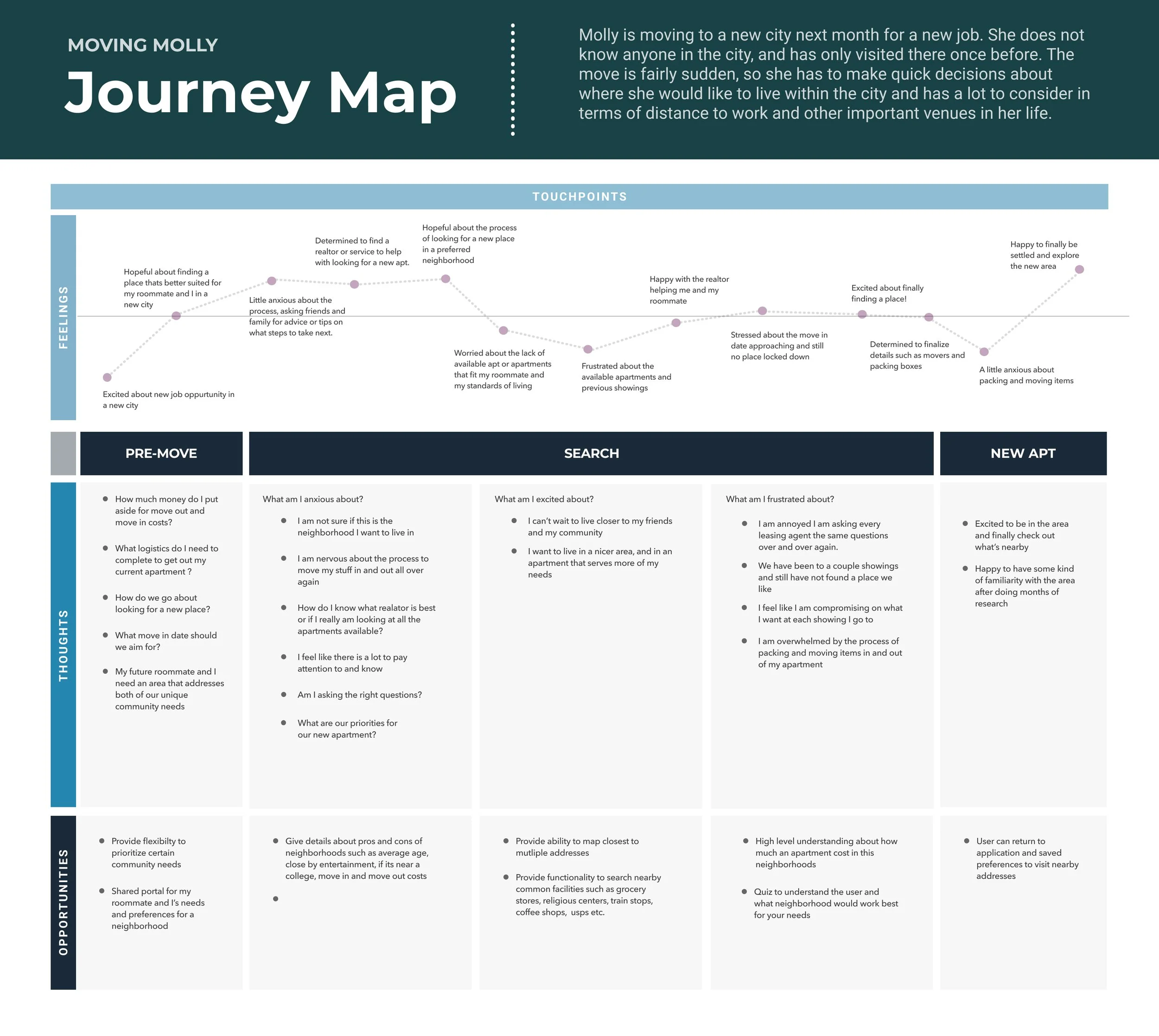
Journey Map
In order to continue building empathy for our users we created a journey map. We mapped the process of deciding to move to a new place and finally deciding a new apartment.
Define
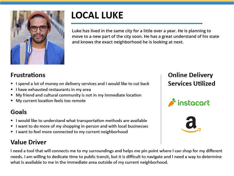
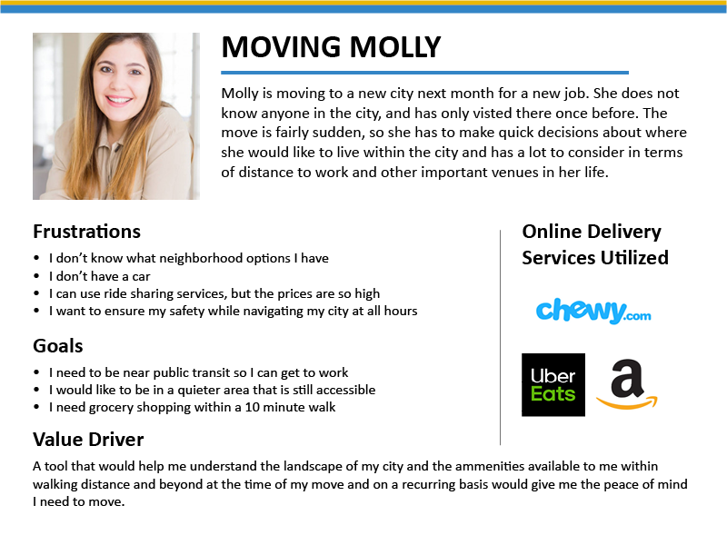
Personas
Through our user interviews and journey map, it was obvious there were two types user personas. We developed “Local Luke” & “Moving Molly“, both of these personas captured the type of people we interviewed — one who is looking for a new apartment in their city and one looking for a new place in a new city.
Feature Brainstorming
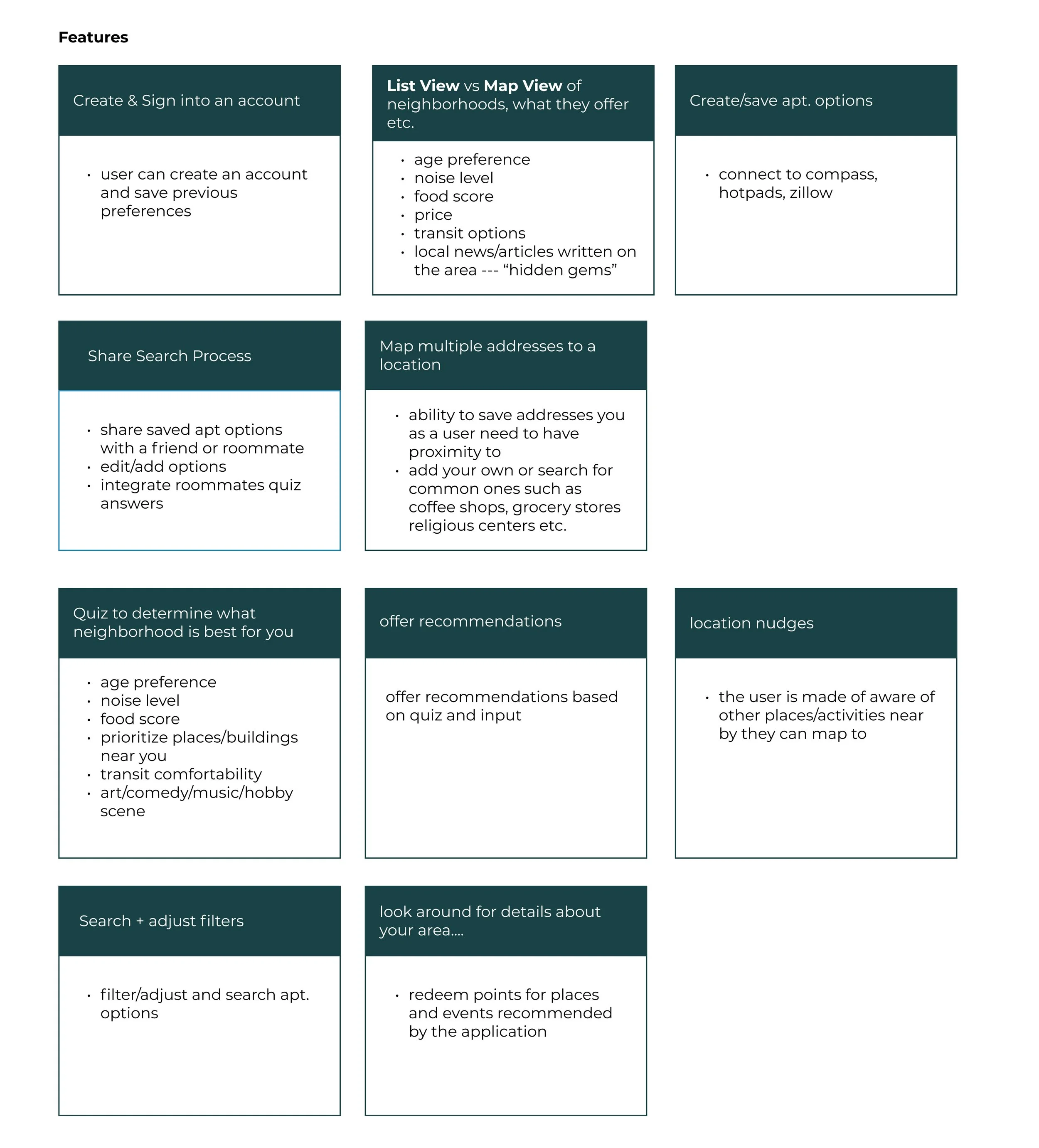
We then continued by thinking of feature ideas given our understanding of the users and what may help solve their concerns. I have organized the ideas to the right.
We prioritized the following ideas to include for MVP
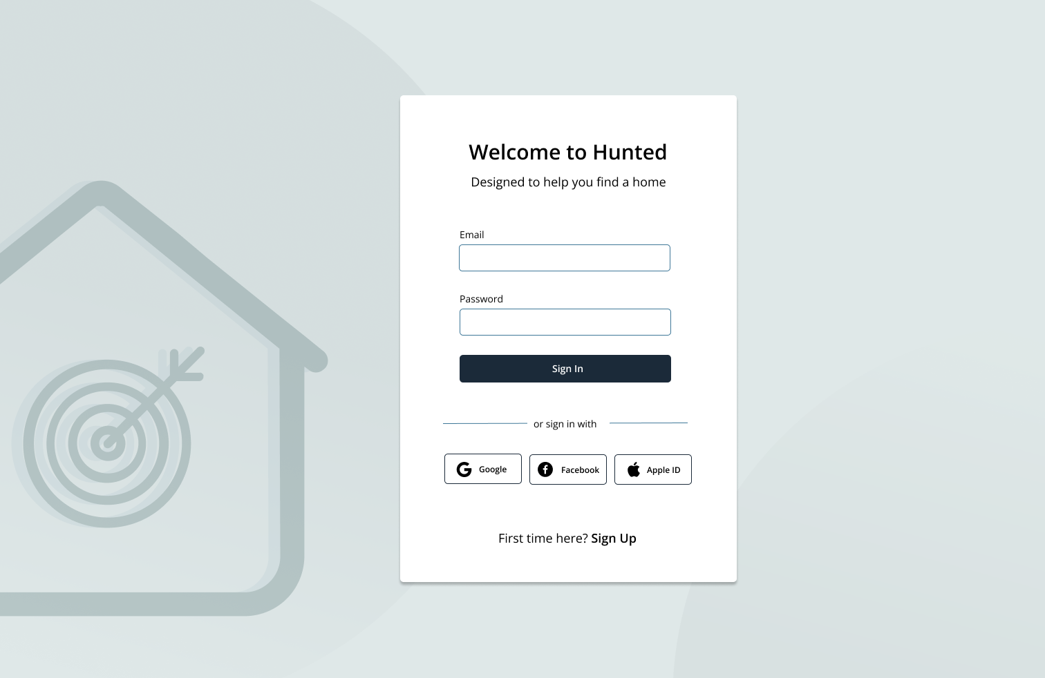
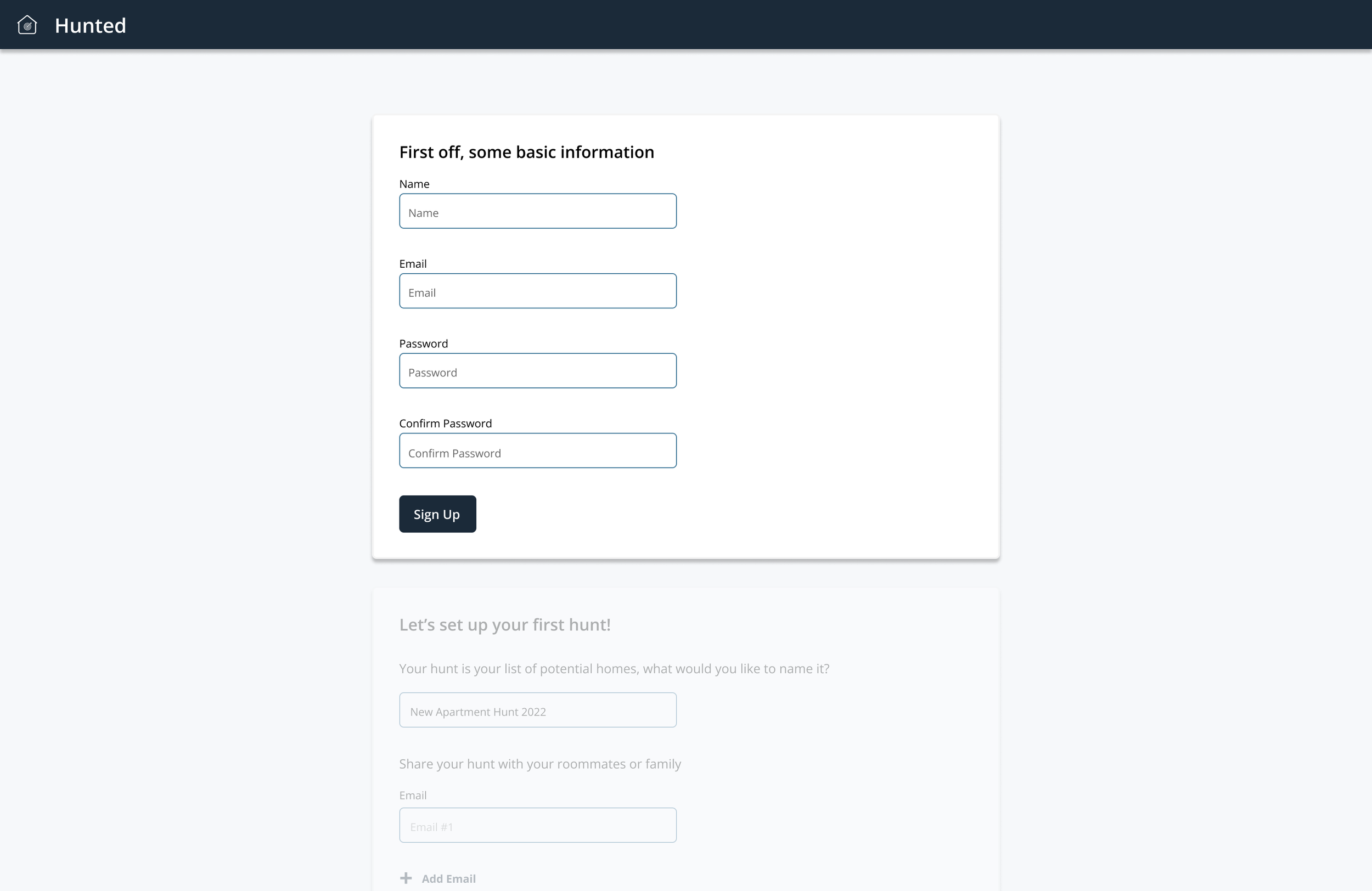
Create and sign into an account
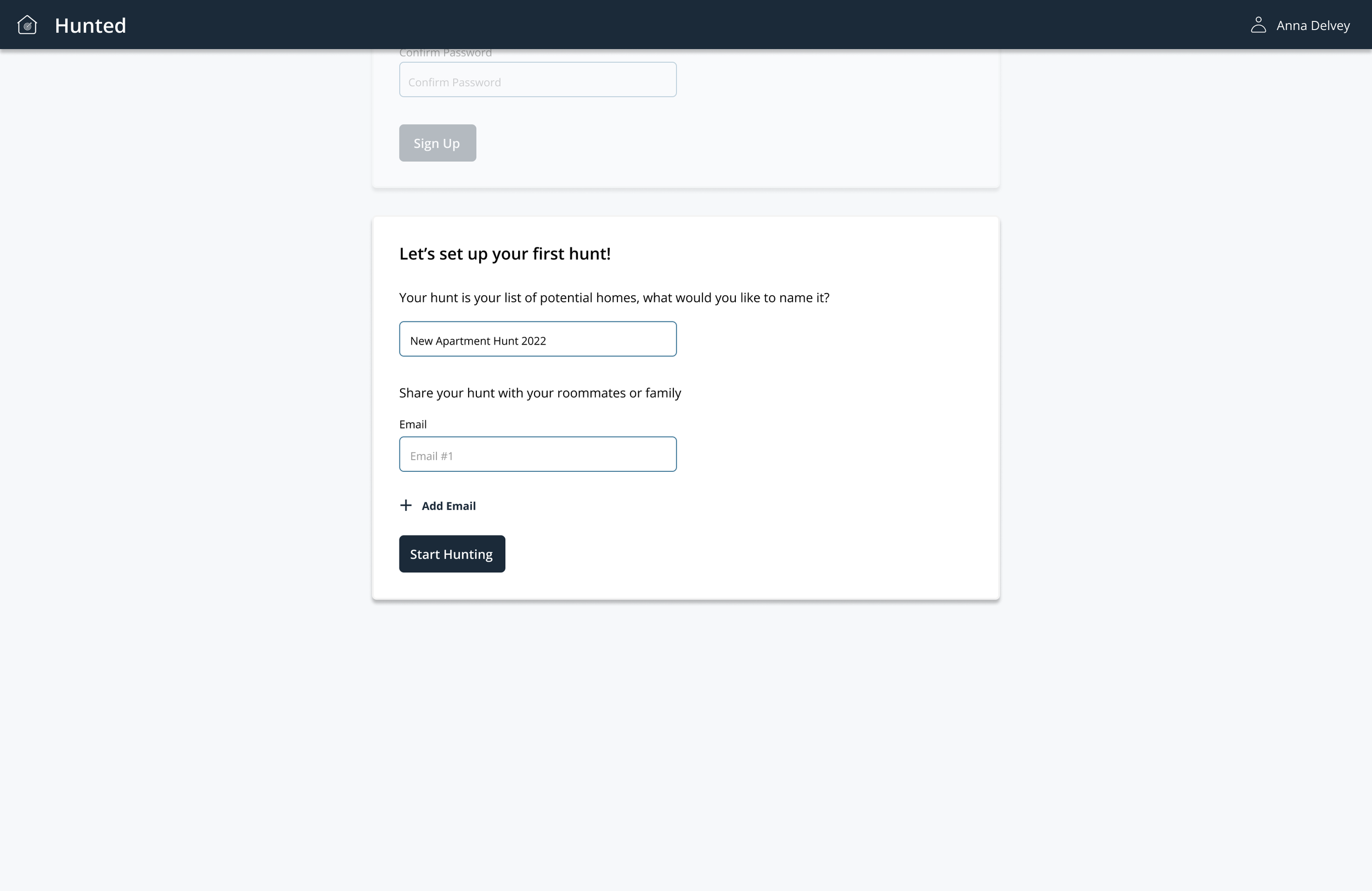
Organizing & naming hunts
Sharing the search process with friends and family
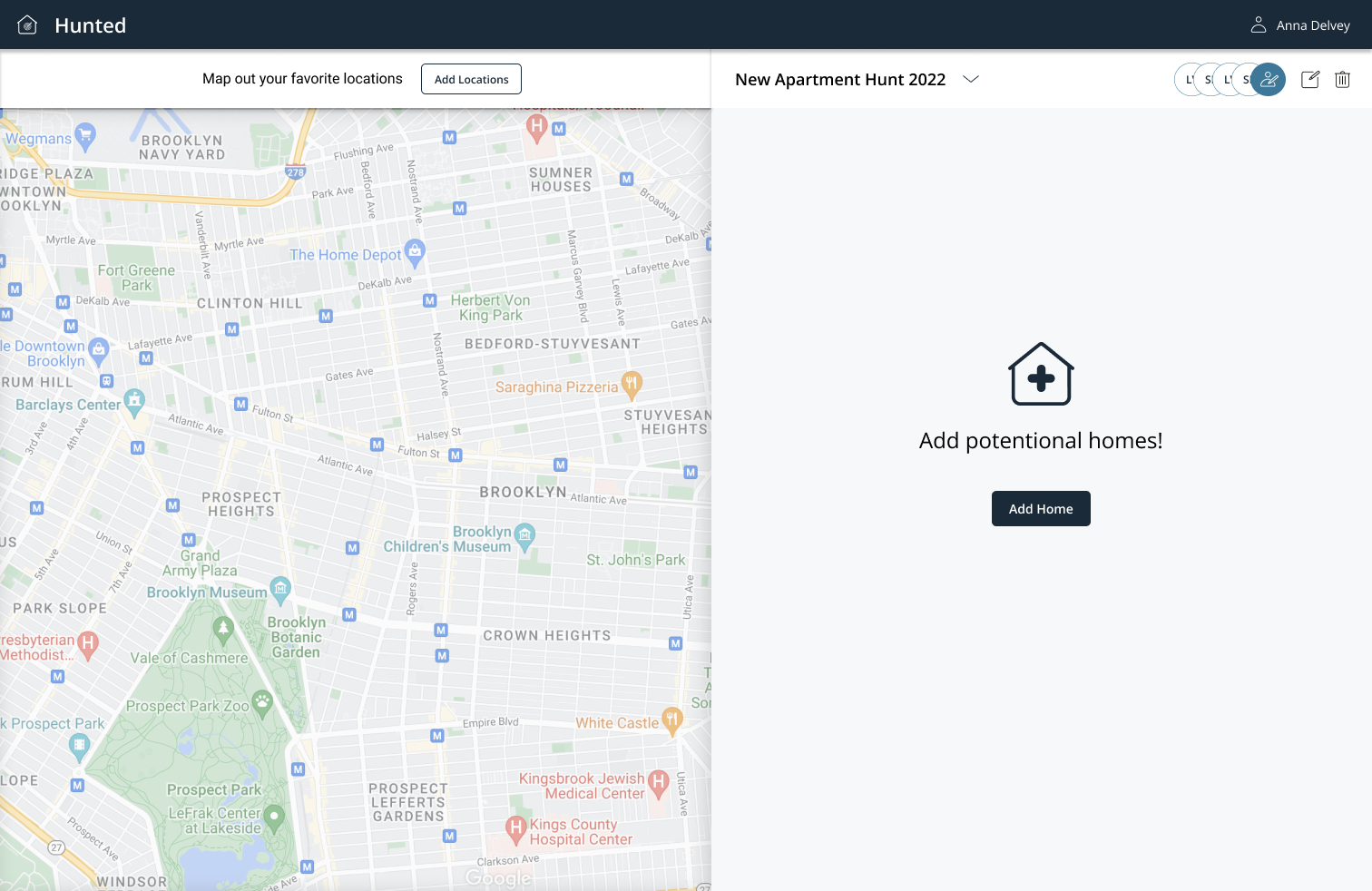
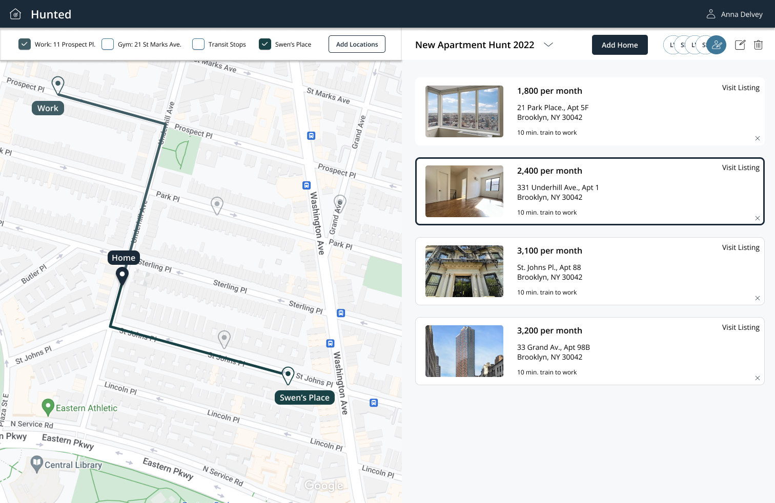
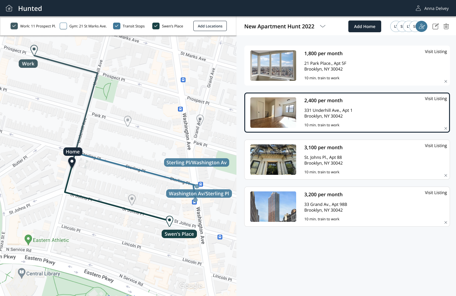
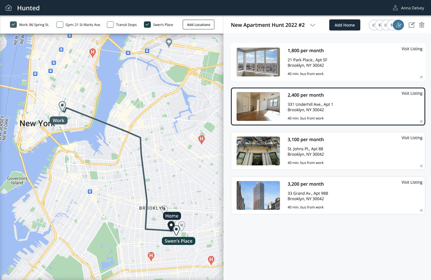
Interactive map featuring what is close to transportation, work, gym and various addresses
Save favorite and potential apartments from various websites e.g Compass, Hotpads, Streeteasy
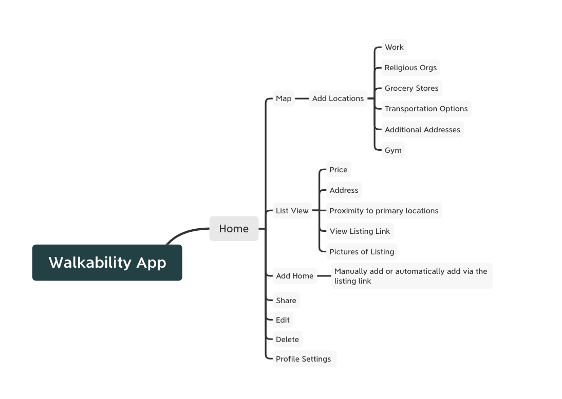
Information Architecture
After considering what features we would include, we created an IA. We played with a couple formats, tried to fit in more features if possible and found this to be the most appropriate structure for MVP.
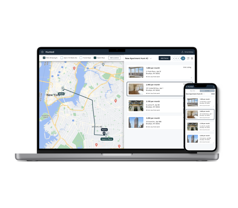
Design
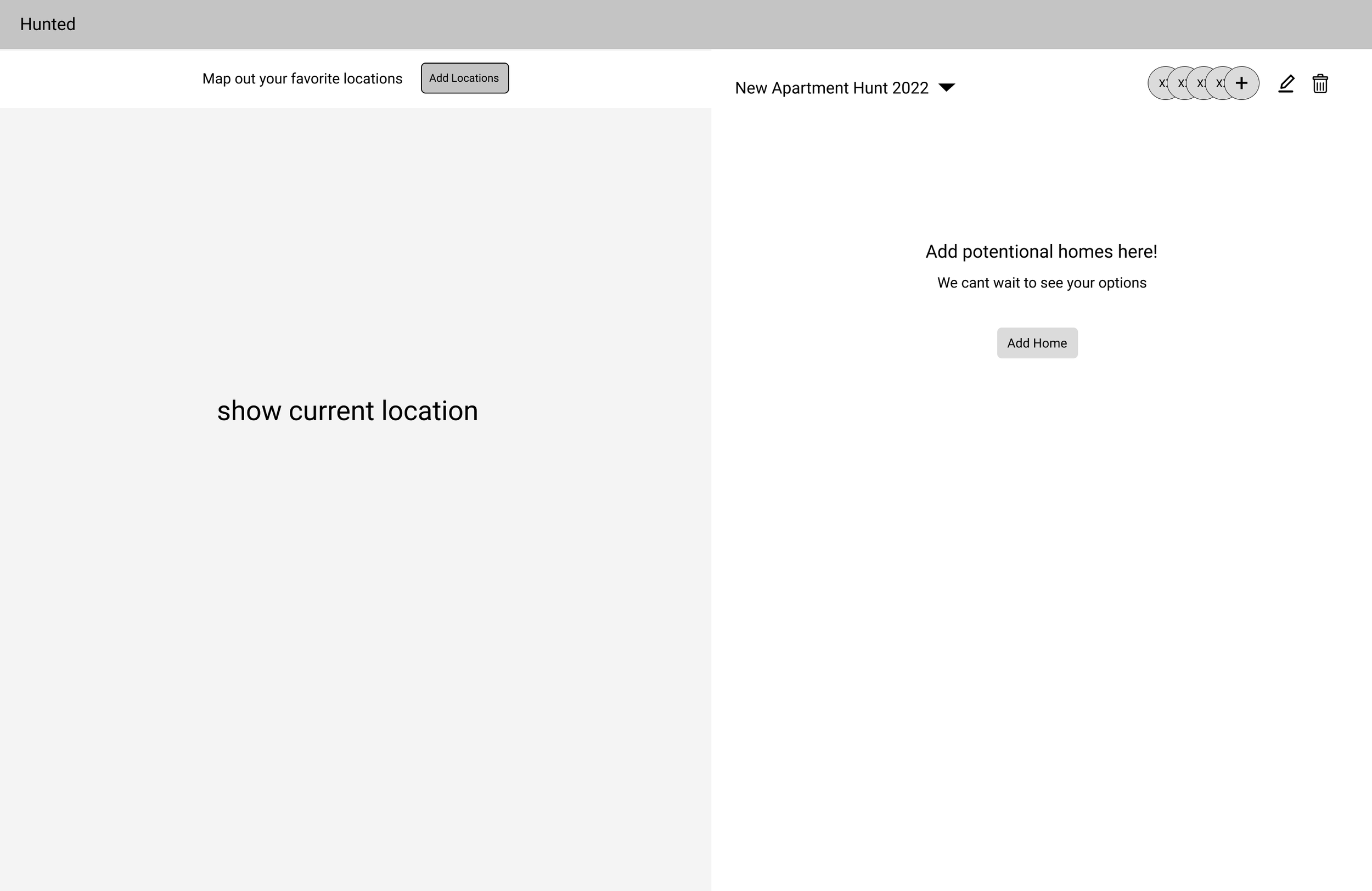
Wireframe
The wireframe and prototype is featured to the right and here.
User Testing
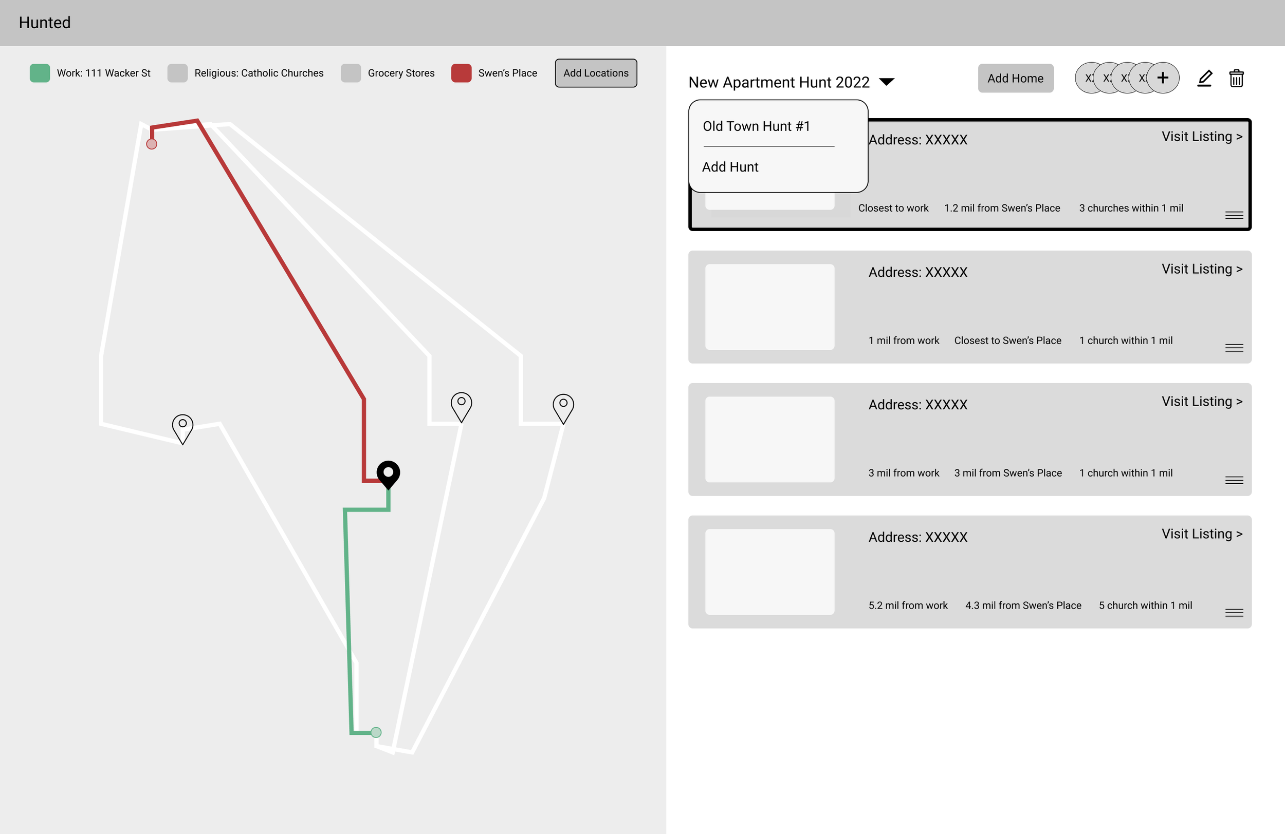
After designing the wireframe I tested the project to discover if the visual cues were clear. Due to the nature of the product and my questions, I decided to add color and build it as a high fidelty prototype, so I could ask the user more questions about the colors used and clarity of visuals. After testing I learned the product needed to be adjusted
Include various options to share e.g. text
Vary the colors in the map so it’s clear what the reference point is
Provide more information about the stops included when the user hovers e.g. Which train stop is this? Which grocery store?
Show the distance by minutes and mode of transportation, not miles
Access the wireframe here
Deliver
High Fidelity
The final product and its changes are featured below and the prototype can be accessed here.
Personal Takeaways
Interviewing Users: Each of my users had a different level of comfort with my specific questions, so learning to phrase the questions differently, create more of a story line or provide different context for each user was important. Being patient with each user and welcoming space for the user to talk allowed for better responses.
Attention to the Map: The map functionally was an experience in itself. I thought about how the user would interpret space and color on the map and through user testing saw how my assumptions played out.