Store Finder Redesign
During my summer internship, we were assigned to redesign the NAPA store finder feature to create a more streamlined, consistent experience.
Why was this important? To redesign this page meant consumers could quickly look for store locations, understand where they could pick up their items, and access the store details pages.
Problem
Some of the main issues with the look and design of the page include
Cognitive overload of information
Lack of clear & instructional copy
Not ADA complaint
Research
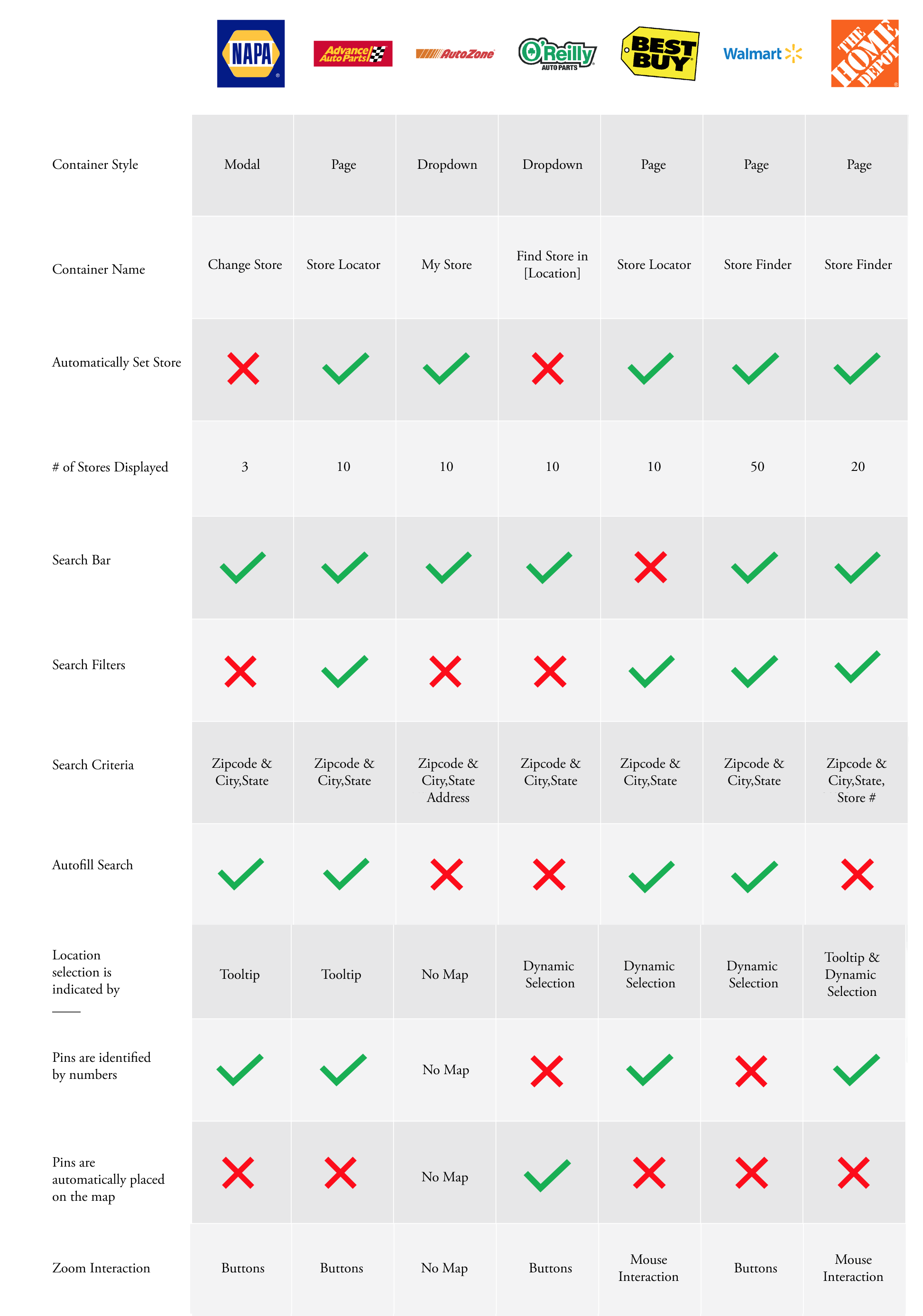
To begin, we took a look at what other companies created for their store finders.
Stores I analyzed include Advance Auto Parts, AutoZone, O'Reillys, Best Buy, Walmart, and Best Buy.
Summary of Competitive Analysis
Container Style and Name: After understanding what other companies did, I realized we needed a modal. The modal didn't disrupt the flow of a user. I also decided to name the button "Change Store" so the action was more clear.
Store Pin Treatment: When the user opened the modal, the GPS should automatically confirm the store closest to them. This will aid the user in their ability to understand they can change the store or stick with the selected option.
Search Bar and Action Treatment: Considering the low number of NAPA stores and the copy limit, the zip code seemed to be the best way to ask the users to search. I decided to include filters to help with users' search and autofill the search if the user moves around the map.
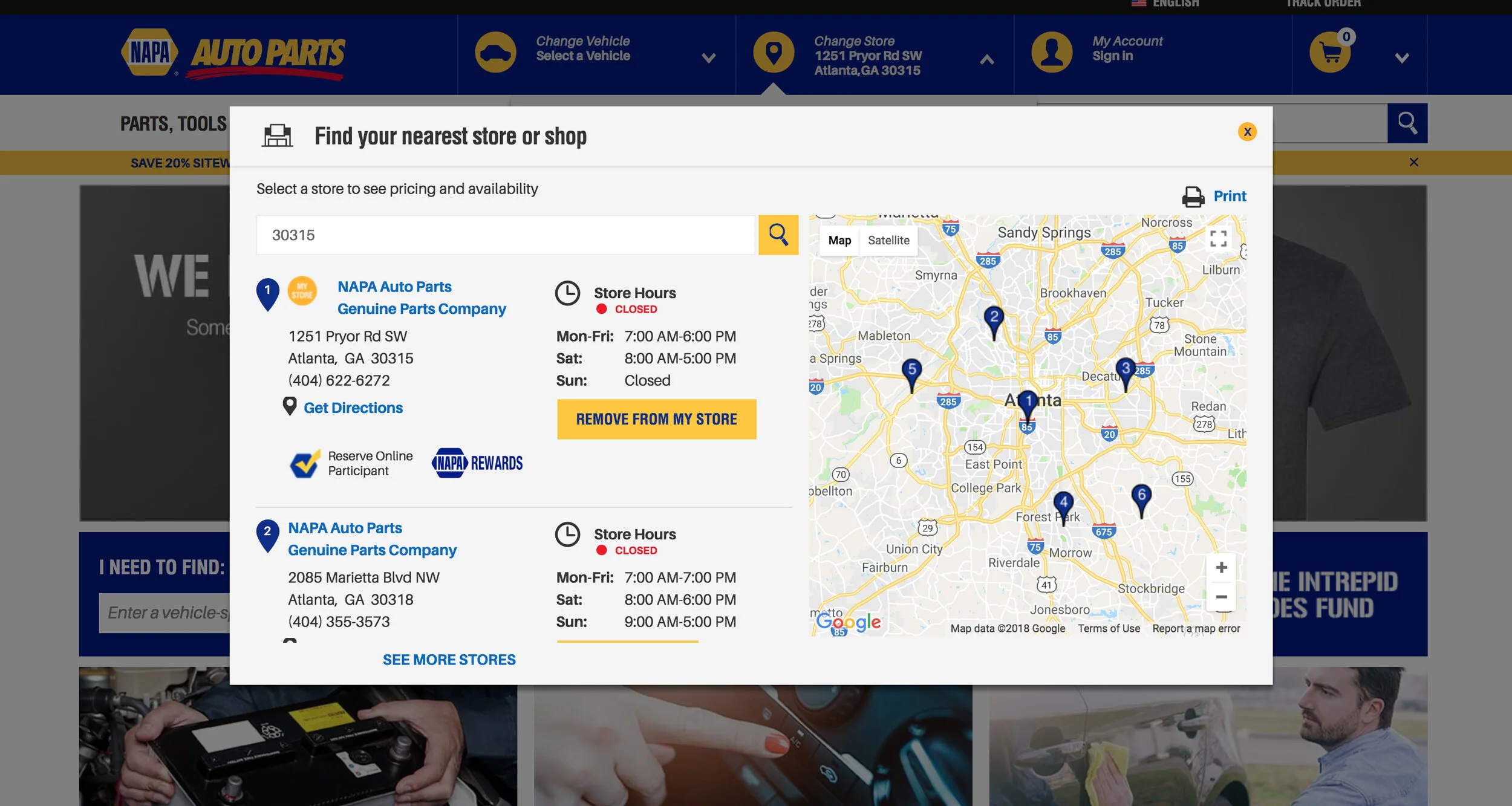
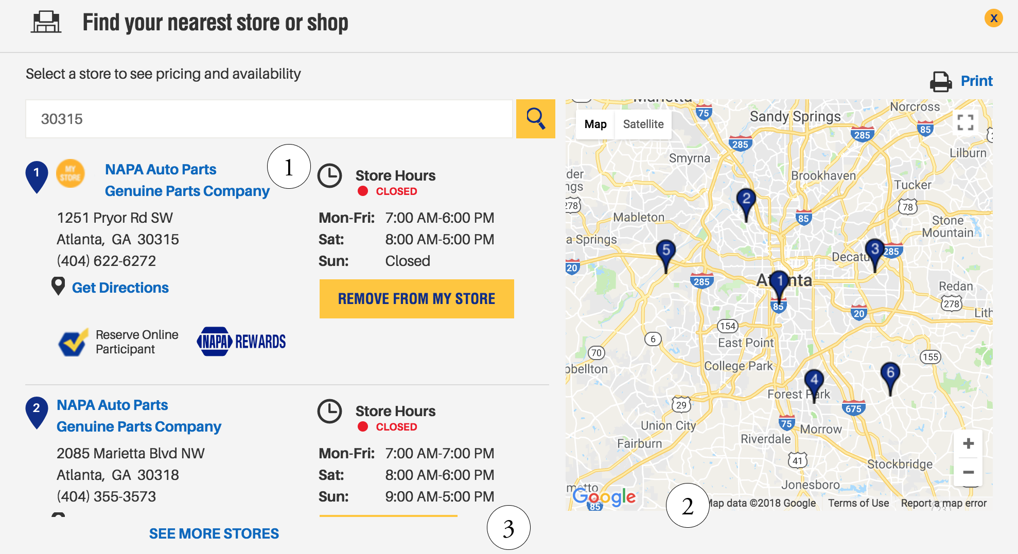
Current State Observations
Next, I used a tool called MouseFlow to watch users interact with the modal. After watching videos of users interacting with the system, I learned a couple of things:
1. Users click on the store name hyperlink and are redirected to the details page and then return back. Users are most likely not satisfied and not expecting the page to reroute.
2. Users move the map around, most likely looking for other store pins to appear on the map
3. Users expect infinite scroll as they scroll down the lists of stores
Summary of current state observations
Clear Copy: critically think about the microcopy on the page
Usable Map: users interact with the map often, so I want build more value in the map
Clear Store Selection: clearly identify the store selection to the pin interaction.
Information Abstraction: only show store hours for that day, address, and phone number. In addition, identify store by city, not name of the store (all stores have the name NAPA so it would be a poor identifier)
Directional Feedback: users will receive confirmation for actions taken that are not disruptive or unclear
About the Future Interface
After discussing this design with the team, and studying the user recorded interactions, we decided to shift the direction of the modal to be a page.
We based this decision on the substantial amount of information we had to include, and the interaction the users would make with the information. A page allowed users to focus on choosing a store and space to explore the map.

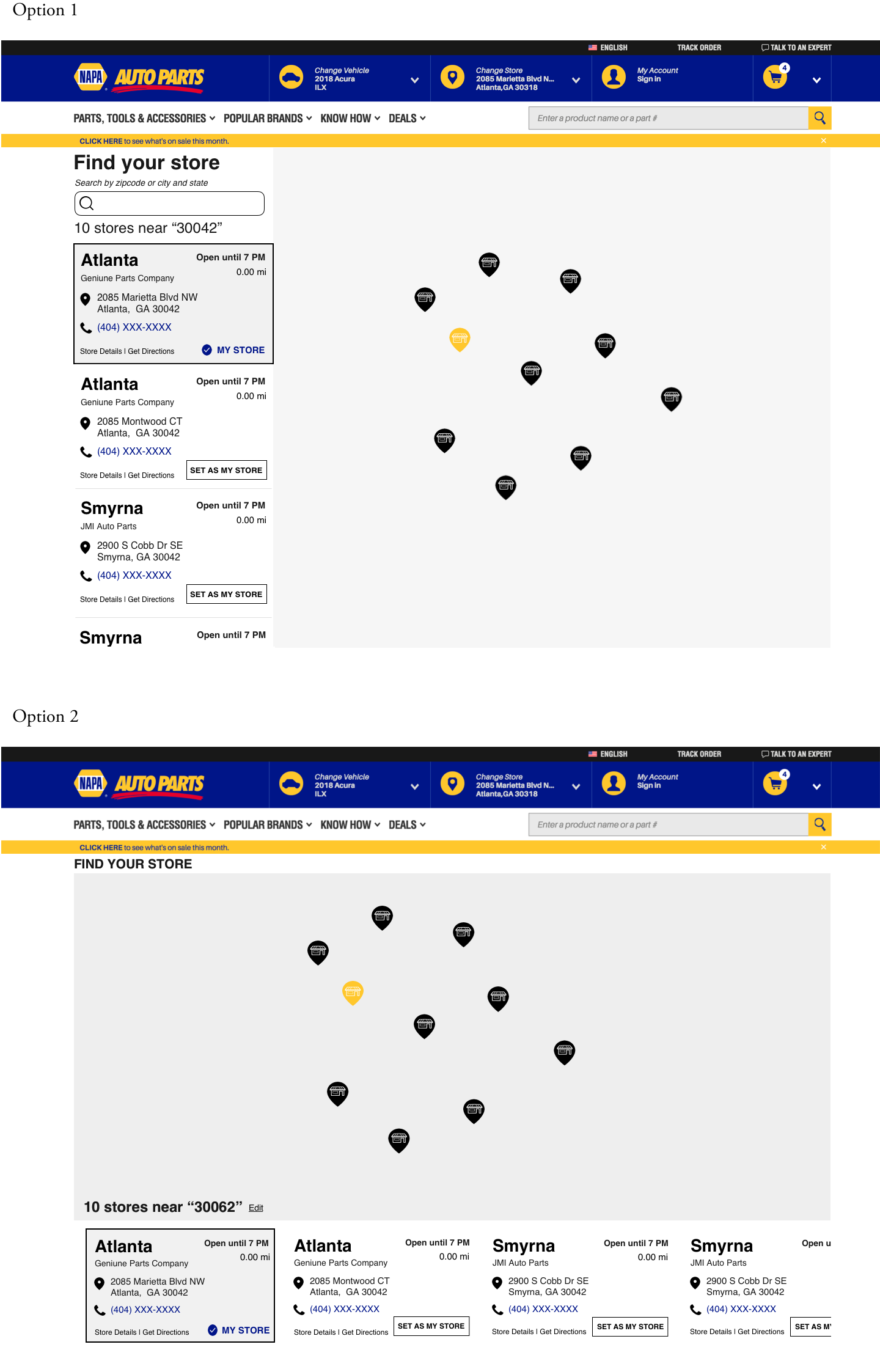
Design Iterations
Option 1: This version includes vertical scrolling, which is a natural and learned behavior for scroll.
Option 2: This version includes horizontal scrolling fixed at the bottom of the page. While the scroll interaction is not common, the design allows for more space and focus on exploring the map.
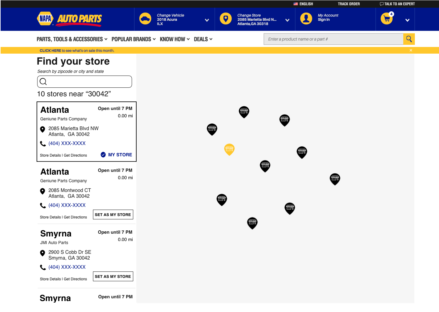
Desktop Wireframe
After discussing the iterations we went with vertical scroll but modified the scroll component to hover over the map. This allowed for more space to view the map.
A full-screen map view is shown to provide the user more space to explore the area
The user only views information pertinent to the user at this moment
Clear copy for the user to understand the CTAs and next steps
Store details is a clearly delineated option to avoid confusion
More stores are shown in one view to allow for a more satisfying map experience
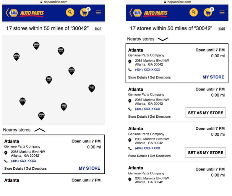
Mobile Wireframe
While designing the mobile wireframe I made sure to prioritize the map to align with user expectations of what they may have seen on the desktop view.
This design allows for:
The map is prioritized in the mobile view to allow for exploration
The scroll component has been redesigned for the mobile experience as a drawer
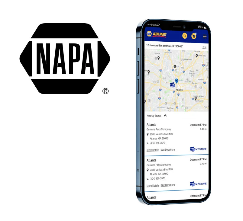
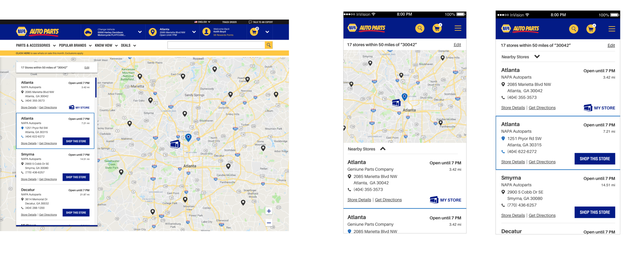
Final Product
After collaboration with a UI designer, the final product is featured below.
Personal Takeaways
Microcopy: The copy on the old site was unclear and contradictory. I made sure my buttons communicated what steps they could take next.
Data driven design: I added value to my design by watching remote sessions of current users. Humanizing the data was what made my design valuable.
Best digital e-commerce practices: While user information is vital to the process, there is a lot of online resources I leveraged to solidify the design.